During July and August, I worked with the startup company for an internship, working initially as an app developer, with the responsibilities to help rebuild the application for version 2.0's release, with new features and design style. During the development of the app, I spent my free time working on an updated mockup of version 2.0 and presented it in front of the CEO, with my new ideas and thoughts on ways to improve the design for better user experience. He agreed with my plan and assigned me as lead visual designer, working on continuing my progress on the mockup and helping innovate new potential features.
During the internship, I took initiative and started work in my time outside of work hours to generate a new mockup as I believed the current design I was basing the app off of was not sufficient and had issues relating the user experience, with seamingly randomly placed elements.
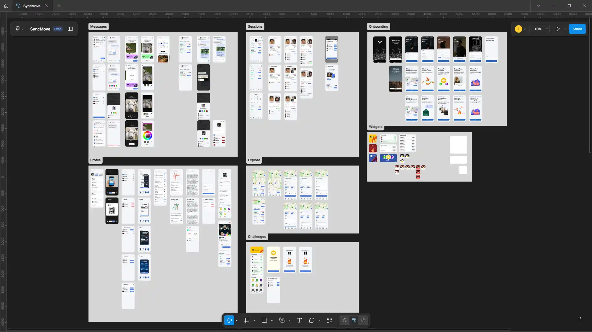
Over the course of a week, I worked on the creation of a few screens using Figma in order to have a better reference point. With the work produced, I decided to show this work to the CEO to which he said, with the work prdocued I could switch to being the lead visual designer, working on finishing the mockup produced and having free reign on coming up with fresh ideas for features in order to increase customer retention. This led to me producing the following mockup.
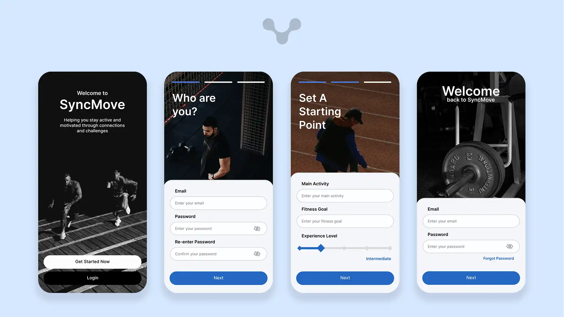
The signup page is designed to be very intuitive and although relatively long, by adding a progress indicator and splitting fields over multiple pages, it reduces the visual overload. The use of having images and headings that use natural language, softens the process and emulates an interaction between the user and the app - with testing, it was found that these changes over the original single page, reduced the dropout rate by over 3/4.
The fields and buttons were moved down to the bottom of the screen, based on user patterns where the most accessible area of the screen is the bottom due to the varying sizes of phone screens. This additional change improved the user retention further, allowing all the fields to stay on one screen without scrolling, giving larger screens, additional space for the background image without having blank space.
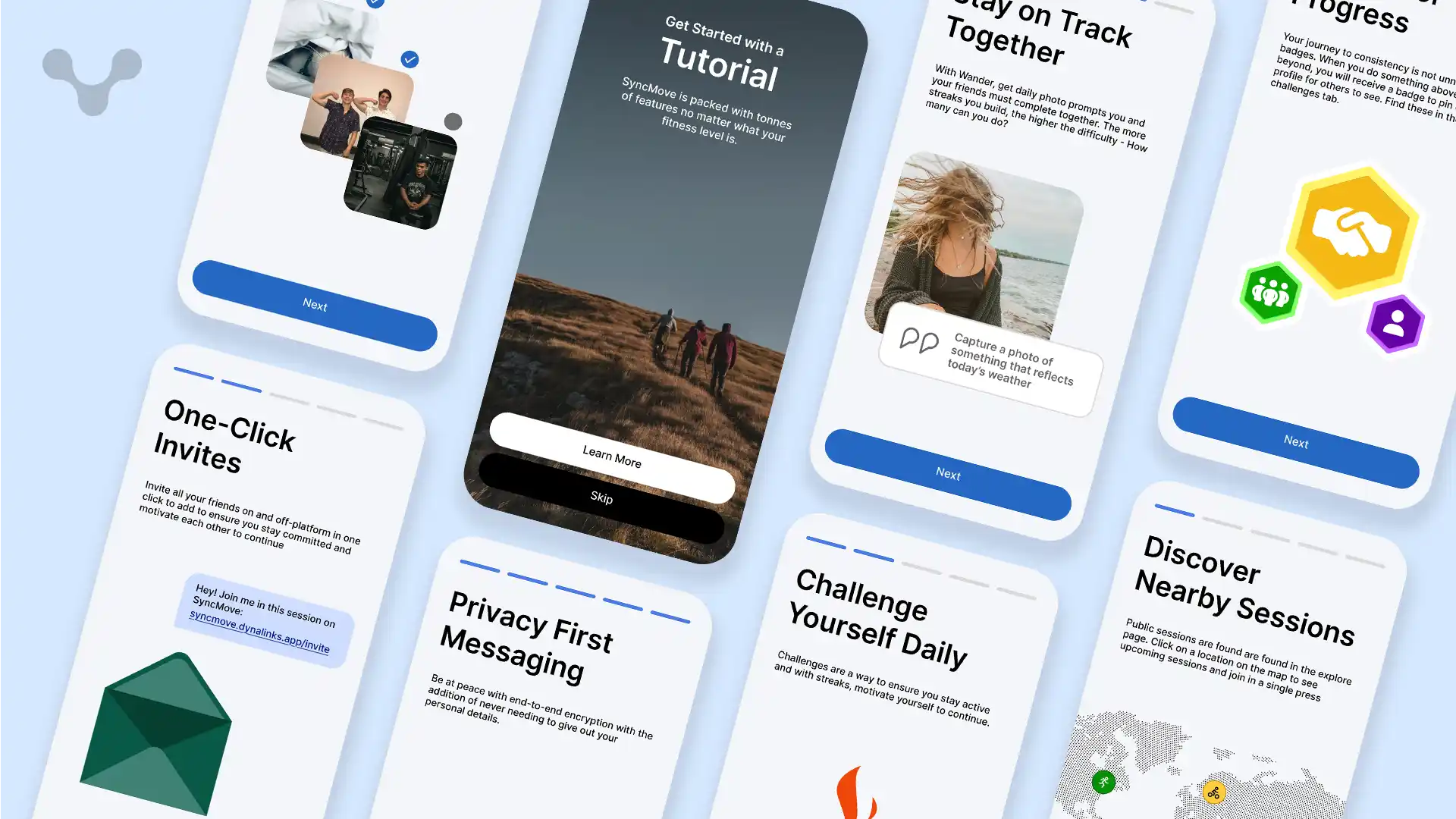
The tutorial was the next area to update in the mockup - Making use of the same design of the signup page, it allowed users to keep their finger in the same area to continue through the process. The original design made use of a simple popup which appears on first launch which could be easily clicked off if in the wrong area; by putting the tutorial as a separate screen, it encouraged people to look through the features and learn more about the app and find new features in the version 2.0 update.
Focus was put on the illustrations, indicating the purpose of each feature and its impact on how it improves the user's overall goal of going out and staying fit with others. With these fun and vibrant designs, it meant that there was no need to include screenshots of the app or guide them through the app but let them explore themself whenever, letting the intuitive design guide them through the app without holding their hand.
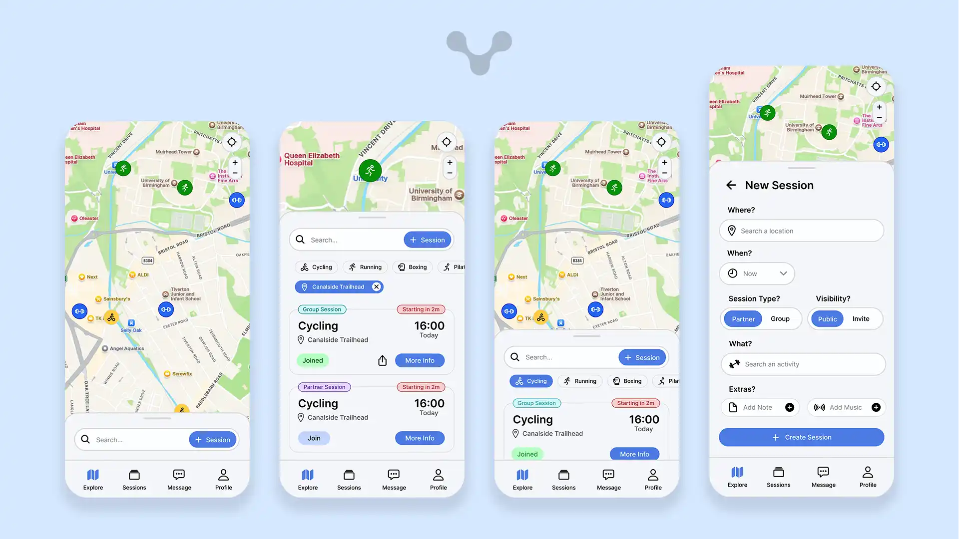
The homepage is the first page that every user goes to when they open the app, meaning that this needs to be the most important area. After some user testing, it was found that the explore page was the most explored section, being used to find sessions nearby. By having it be first, it allows users to find sessions instantly or create new ones, having a feed-like area where upcoming sessions show up first. Without anything selected, the session that is starting soonest will appear with the time until starting allowing for those who are out to join it at a moments notice. Dragging the card up reveals the full list of sessions with their start times displayed and the type of activity showing up largest.
Whenever there are many sessions in the area, it may be easier to use a filter - by either selecting a location on the map, selecting an activity from the list of activities, it would narrow down the number of sessions to pick from, allowing for quick and easy searching. With the use of the search bar, this gets put to a new level, using complex algorithms to search using natural language, taking into account the following data points; activity, location, time, users, description, session type and past sessions in order to find the most suitable session based on the search query.
The cards which make up the list, have additionally been crafted for efficiency, containing all the information required for the session from a single card. Depending on the status of the card, different pieces of data will be displayed in order to reduce clutter
Session Type: The session type is displayed over the card at the top right, helping those who want a more one-to-one experience or a more social experience. Having 2 distinct colours help differentiate this and displaying it first makes it easy to skim through
- Time Remaining: For sessions starting in less than 2 hours, an additonal tag is added to the top right in red, displaying the urgency that they need more people to join and can help those who are running the session find more people, with studies showing that the colour red, draws the eye more than any other colour.
- Join Status: The join status adapts based on if you have either not joined yet, are pending approval, joined or if the session has stopped looking for people - each has its own colour
- Share: The share button appears when the user has a join status of either pending or joined, and it is a group session, allowing them to share it with other people so that they can also join the session.
Having a way to find public sessions may be good but sometimes, people may not find what they need. The new session button is integrated into the search button, available to press even when the bottom card is closed keeping it as simple as possible to start a new session. Sessions can then be created within a single page - previously, it was a popup with 5 different sub-pages that was found to be a large pain point as to why people did not create sessions but with a single page it almost doubled the rate at which people created sessions. Many the fields in this updated design, additionally automatically fill in the fields based on the filters selected - this move was based on additional research finding that commonly those exploring with filters would create a session with those filters again so by removing an additional pain point, it would increase the chance of follow-through.
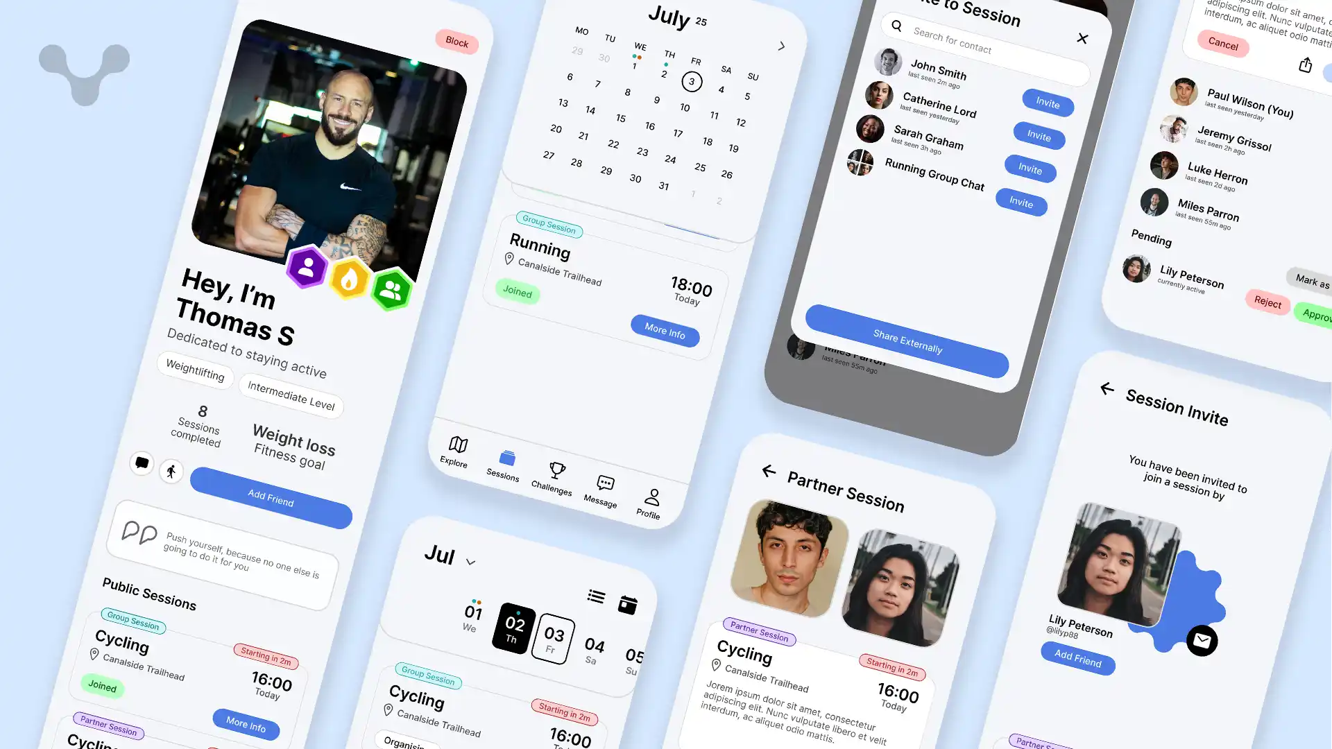
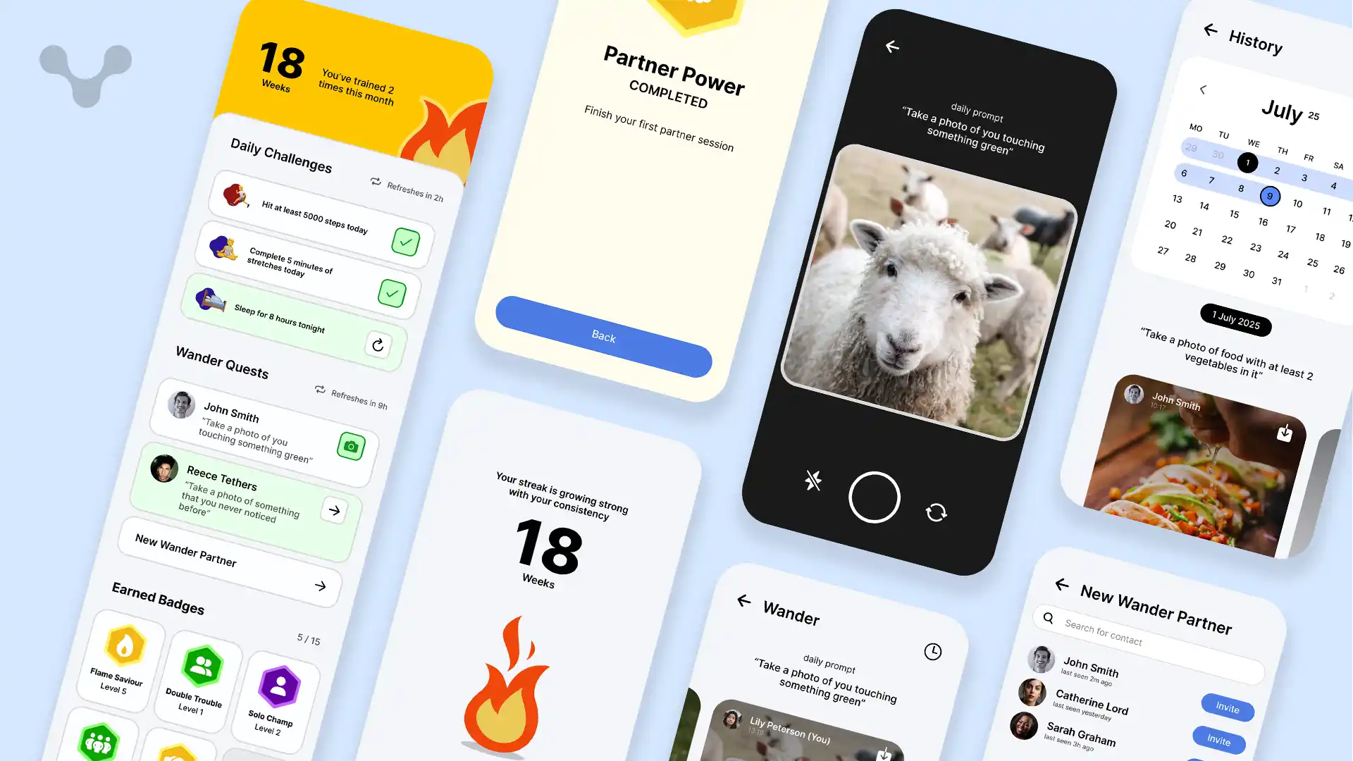
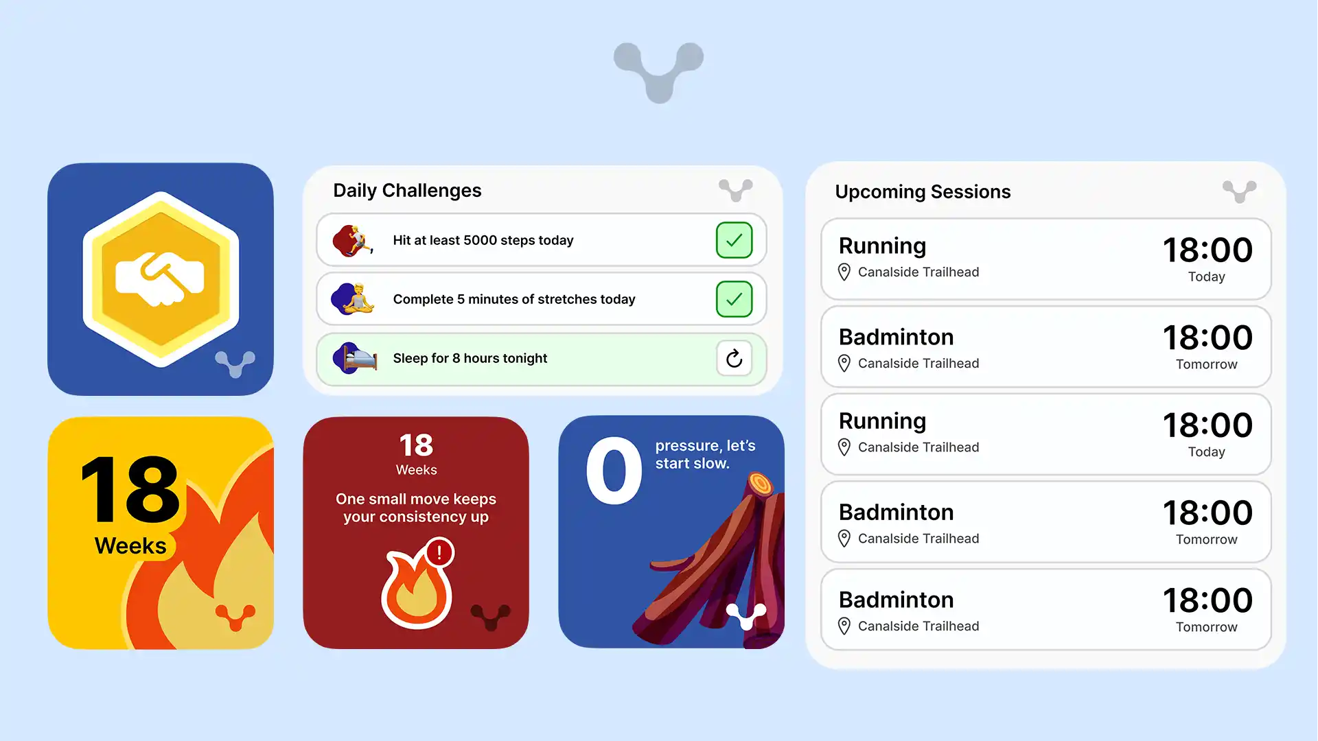
Sessions are the key selling point of SyncMove, meaning it is core that it is done correctly. Any sessions that you are part of, including as the person running it or are participating in are kept in the Sessions tab, able to be searched using the date slider or if searching for a specific date, can be selected using the date picker. By having these two modes, it allows for casual scrolling and querying - two different types of searching. Sessions for a date are sorted by time and if the current date, a line separates previous sessions and upcoming sessions, making it easy to track when you have lots of sessions in a day. Markers on the calendar indicate whenever you have a session a date, dislaying up to 3 different markers, colour coordinated by the session type (partner or group). For better user navigation, a today button can be found in the date picker and today's date is outlined.
Sessions can be viewed in detail, giving access to view the description for the session and details of who is in the session. With the length that descriptions can be depending on how much is needed, it was felt suitable to have it not be in the summary card but in the full session page. For those not organising the session, they are able to see who is in the session and depending on the member's privacy settings, can view their profile. For organisers, they additional moderation tools, with the ability to open invites and approve or reject people wanting to join. This feature was imperative to ensuring that the app is safe for everyone, allowing only those granted to join - members of this session, can additionally open a group chat to message about this, with new members added automatically.
Invites can be sent by both the organiser and those who are members to which if sent externally through a link, after clicking, will redirect to the app and open a page indicating who invited you and the session card to view more info - By having the user who sent the invite viewable, it allows those who are new to SyncMove to add the person as a friend at the same time as joining the session.
Profiles are important to understand who people are in SyncMove, so in order to humanise people, their profile is put front and centre on both sessions and their profile, taking much of the screen; descriptions have been added as well as a place for quotes to provide additional customisability. Depending on the user's profile visibility settings, they may choose to have their profile be completely private where only their name and profile image shows, friends only, members only or public. Additional measures can be implemented including the block functionality, blocking someone from being able to see anything other than the name and username of the user.
Challenges are a way to level up people's enthusiasm and keep them them them wanting to stay active - With a variety of different challenge there is something for everyone
Sessions may be the selling factor but daily challenges ensure that even when others aren't available, you can still stay motivated to keep fit. With these challenges, they are designed to be relatively easy to complete, with assigned challenges to do. To personalise the experience for each user, these challenges would be custom based on the activities you have done in the past and the challenges you were able to complete in the past. With these types of challenges, a balance could be made where the difficulty would increase depending on how many challenges were completed in the past - If they were able to do them all, they would get harder and vice vera.
The addition of a reset timer has been found to help users understand when it gets reset as a reset at midnight may not be ideal since especially students may still be doing activities so would be more ideal to reset at 3am. This additional 3 hours gives time for people who see it is the end of the day to try and do some of these to end the day.
Wander Quests are daily challenges done with a partner, ideal for those who are long-distance with someone or just want to have fun. Each day, a prompt will tell you to take a photograph of something specific, for example taking a picture of something that represents the current weather. This type of prompt not only keeps people moving around and being creative but also can spark conversation with the people you may not know much, filling the time between sessions and keeping connections. By having more wander quests active at once, it can increase the challenge allowing for a wider difficulty range without setting limits. After completing the quest, you can view the partners' photo as well and share it, increasing the vitality.
The Badges in SyncMove are a way to look at long-term growth at a glance on top of giving people goals to do over the course of months. With many of the badges, they have levels where each level increases in the difficulty of getting, for example the "Double Trouble" badge indicates how many times you have done a partner session. At level 1, one session, at level 2, three sessions and so on. These badges can additionally be displayed on your profile to show off your progress and display your achievements.
The streak is a powerful tool to keep people on the app daily, with it supporting the user to complete challenges. The streak is sustained when the user either completes a daily challenge, wander quest or a session, allowing for a low requirement to hold the streak while also making sure that they are active. By having the streak as a nudging factor, although it may cause slight irritance, the cause behind it allows them to stay accountable with themself. Many of these challenges and session card can also be added as widgets to the homescreen or even the streak flame, keeping them engaged even whilst the app is closed.
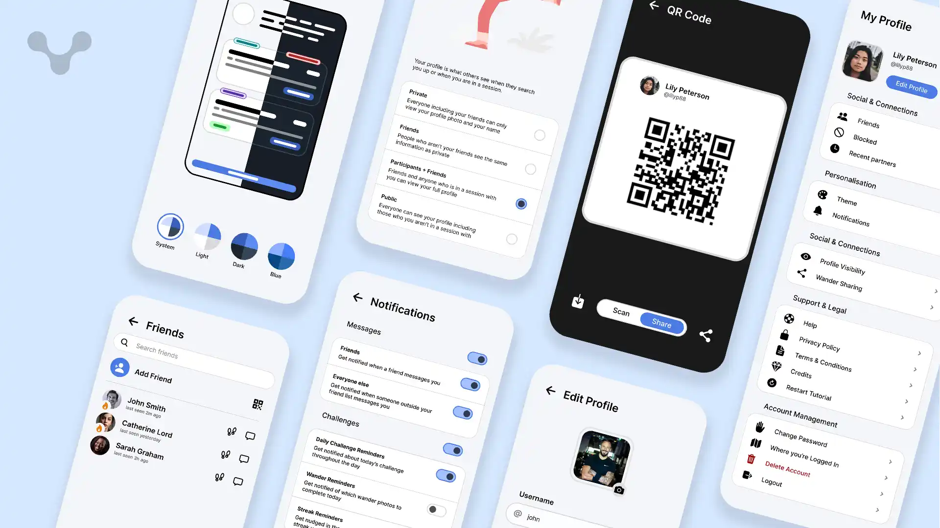
The profile tab is the location to edit and view the grit of the app. Due to the sheer amount of small parts of the app, the easiest way to do this was to split into headings based on what each section did. These include categories like Socials and account management. By splitting it like this, it makes it easier to navigate without going through sub-menus.
At the top of the profile tab, you are able to modify your profile, able to edit everything from your username to your quote. Additionally, you can choose to share your profile either through a link or via the built-in QR code scanner and generator. This not only means that you don't have to search for someone using their username but also makes means you can share it online with a single link.
Themes is a way to liven up an app, by having an additional blue theme to the app and potentially more, it provides a way for users to make the app feel like it is theres, fitting with the theme of their device - potentially, an additional colour picker could be made which generates a theme based on a single colour that reflavoures the entire app to fit with it.
Notifications are key to keeping engagement high on the app, notifying the user of sessions, challenges and messages but with so many places to get notifications from, it is important to be able to customise which ones the user gets so by having labeled ntoification types, notifications can be tailored any way in order to keep people from disabling all notifications and missing out on the important events.
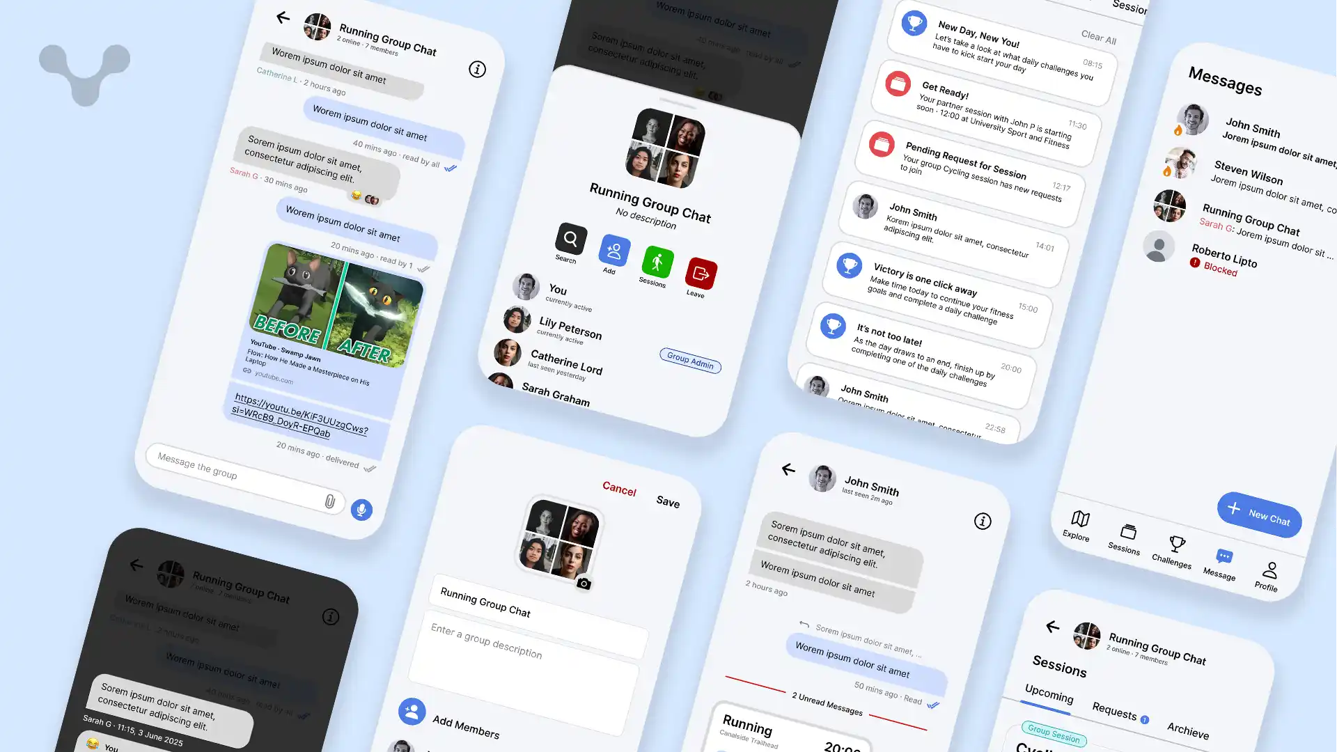
Key for communication, the messages tab ensures that everyone is connected without the need to give out personal information. This privacy ensures that you can check if someone is a good fit for the session you are running while keeping everything on-platform. Messages are content rich, allowing for many of the RCS features including GIFs, Media, Reactions, replies and read receipts. Including these means that there is less of a need to leave platform plus with additional built-in integrations with other features like direct session invites and Wonder Quest instant images, means that you can continue the conversation and reference those for reduced friction and more fun.
Just like many other platforms, you can also create group chats, including ways to manage it by having admins, allowing you to add and remove people and change the group chat name and description. Sessions can be created privately for a group as well, with a way to see who has accepted or rejected joining a session and seeing upcoming sessions just for the group. This tight knit integration has been found through research to sway people to stay on the app for strangers rather than using their native messaging app for 3 out of 4 people.
Widgets help people to quickly access apps without opening them - by making it display things including upcoming sessions and challenges to complete, at a glance you can see everything you need. Not only this but the homepage is also about aesthetics and the need to personalise it. With the inclusion of the streak flame and the badges, it incentivies to both keep up with streaks and gain badges to display them to show your progress, higher level badges including custom effects like shimering sparkles and glowing. Streaks that are not complete for the day will give you motivational quotes and words of encouragement to motivate the user to reopen the app and continue their streak. Combined, these widgets act as an unconscious decision to reopen the app again.
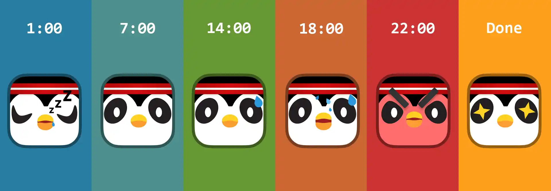
The app icon is the first thing people see so it is imperative this gives the right message for people and keeps people from ignoring the application. The idea behind having an icon that changes over the day is that based on if the user hasn't completed a task in the day, the penguin will begin to get more stressed until it is done, after which the bird will be pleased. This system was based on Duolingo and has been studied thoughrouly to give reinforcement to stay active. Although this penguin is not used throughout the app, I can see in the future, using it for both advertising and integrating it into some of the vector images, animating it and building more encouragement for the user.
The gamification throughout the application including the icon has meant that the overall design feels less like a utility app and more as a game and a fun way to hang out with new people and socialise, the main goal behind SyncMove and getting people to stay active.